Box Type Categories for Easier Selling
 The Box Type display on the Sell Boxes screen has always bothered me.
We have over 50 different box types and this list is constantly growing. To make listing simpler and less overwhelming we default to showing just the 5 most common box types. Potential sellers had to click on the View All Box Types link to see the entire list, but there were a several problems.
Regardless of how hard I tried to make ‘View All’ links prominent, people routinely ignored them. They’d scroll up and down and leave. Or they’d call asking when we’ll have a box type available. The design clearly wasn’t intuitive.
And the people who found the links were greeted with a very long display of box types. Although the list was sorted, it was quite intimidating.
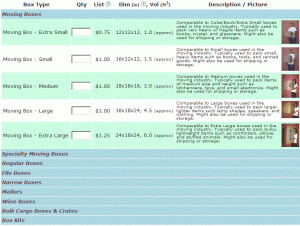
I’ve always wanted to add a categorization system to the list and finally found the time to do it. The list is now broken into 9 major categories. The same 5 boxes are shown by default, but the list of categories makes clear that many other types are available. Clicking on the category expands it. Even if all the categories are expanded, the category headers add structure and break up the full list, making it far less intimidating.
Overall it’s far more intuitive and pleasant. At least it seems that way to me; I’ll be watching how users interact with the new layout.
This change may seem a bit obvious, but there are logical challenges with assigning categories and technical complexities with building a dynamic form that made me not want to add complexity early on. I was pleasantly surprised by how few issues I ran into getting this implemented.


 We help boxes live longer: